Adding foiling, embossing or some other form of embellishment to your work can really set that work apart. Charlie Kortens found out more
Adding that little something extra to your printed work, some sparkle, some pizzazz, some flair, can make the difference between packaging that really grabs the consumer, and packaging that doesn’t. Fortunately there are a variety of different ways of adding this embellishment and several outstanding examples were submitted to this year’s FlexoTech Awards. This included work by Kwality Offset Printers, which won the Best use of embellishments award, and by Kingfisher Labels, which was nominated in the same category. There was also an Embellishment Showcase, put together by Amberley Labels, which won in the Promotional print category.
FlexoTech spoke to representatives of all three companies to find out how they did it…
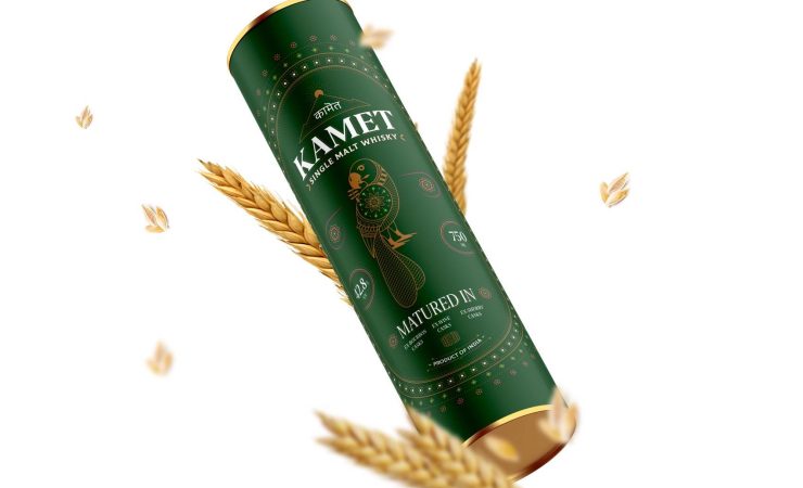
Kwality Offset Printers’ entry was produced for Kamet Whisky, as the company’s Krish Chhatwal explained, ‘Kamet is an Indian single malt whisky producer that prides itself on local production from indigenous barley. We were associated with the brand for other projects in the past. ‘With other successful launches behind us, the customer showed keen interest and trust in us to develop this new packaging as well. What Kamet wanted was to match its digital label sample printed in Australia using three kinds of foils and a special wine paper.
We planned to highlight all elements using a special mesh of rotary screen to add a 3D tactile effect on a metallic substrate which would give them a similar look as well as being cost-efficient. The idea was to do justice with the bottle and bottle label. We had to create a canister label that matched the end product created before the canister was launched. So we had to keep all the other elements in mind to create a more luxurious final look.’ In terms of the equipment used to create these effects, Mr Chhatwal said, ‘A Mark Andy flexo press was used to produce the label.
Mark Andy machines are known to give excellent results even at high speeds and It was truly instrumental in producing a wonderful product. ‘Hybrid software was used to create important spot UV and white layers with utmost precision, and a Kodak Flexcel NX system was used in producing the plates. There is no dot gain or blurry images when using this system. Although Kodak plates are known to be more expensive than alternatives, it’s worth it when you are looking to create a masterpiece!’ Of course, as you’d expect when producing delicate work, various challenges and obstacles arose. Mr Chhatwal expanded, ‘The first (challenge) was to match the canister labels with bottle labels already created in Australia. We had to give it a more luxurious look than other single malt whisky competitors in the market. Next was adding 3D tactile embossing to all elements in the job, even the minutest of the lines and dots. And finally, we had to finish the job successfully with a soft velvet touch, giving it three foil shade effects.
We overcame these challenges using Kodak technology for platemaking, which gave us great print results. When it comes to pre-press, we used Hybrid software to create all the layers. Our own expertise also came into play, we used our years of experience to pull off such a complicated label in a single pass.’ We also took the opportunity to ask Mr Chatwal if there were any wider industry or market trends (referring specifically to embellishments) that he was keeping an eye on. ‘Lately we have seen more people using embellishments like metallic inks instead of foil stamping,’ he said. ‘This may be due to environment concerns as well as cost pressures.
Many brands are also using fluorescent inks to gain shelf advantage in the marketplace. The market is still growing however, we have lately seen 25-30% growth in tactile effect labels.’
Kingfisher Labels’ entry was produced for Moor Beer which, as the company’s business development manager, Alexandra Phelps, explained, ‘is one of our regular local breweries which order labels with Kingfisher, and their designer is always willing to push the boundaries and play with design concepts. We have been dealing with Moor Beer for years, and the design concept was partly a collaborative experience. After speaking with the designer, using our extensive knowledge, we advised a pattern heavy texture matte varnish would allow for a bigger shelf impact and utilise the material to really make the label eye catching.’ In terms of the equipment used, Ms Phelps says, ‘A pattern heavy texture matte varnish to leave unvarnished areas naturally glossy as per the substrate.
Simple, but effective in utilising the metallic aspect of the silver pp, to mimic a foil being used. This was achieved using high definition NX plates on our eight colour Edale press. The design also includes a white layer, printed first, to allow the process colours to sit on top and be solid as opposed to metallic. This strong opaque white really enhances the colours used for a vibrant crisp print.’ Like Kwality, Kingfisher had obstacles to overcome. Ms Phelps highlighted, ‘The artwork file initially was supplied without a pattern varnish, with the customer contemplating a flood or even dropping the varnish altogether. After working together with our customer, we agreed that the pattern heavy texture matte varnish would really benefit the design of the label and work incredibly well with the design concept given the pattern white elements.’ She also had plenty to say about wider developments in the market. ‘A lot of our customers use silver pp to achieve metallic colours without having to buy in specialist inks, this is an incredibly effective way of obtaining a wide spectrum of different shades of metallics. We also use this print method with cold foil, by playing with inks to gauge what colours we can achieve. ‘This means those customers wanting white or clear labels can also use this embellishment without comprising on design. We have a range of customers who use our sustainable options when it comes to substrates, which silver plastic would not be a suitable option to incorporate in their design. Printing on sustainable material, using cold foil and an ink colour of choice, allows for a label design to be innovative and push the boundaries with design concepts and finishes, without compromising the sustainability element. ‘Printing using different varnish finishes has always been a hugely popular method of print, across the board. Playing with textures and finishes is widely used across all customer sectors and a strong trend that can really make a major impact on a label design.’
Amberley Label’s entry was a little different, being submitted into our Promotional print category, rather than Best use of embellishments. Nevertheless, as an embellishment showcase, it certainly fits the bill for this feature. The company’s managing director, David Richards, explained the story behind the showcase. ‘Amberley’s Embellishment Showcase provides label inspiration for luxury finishing, brand enhancement and decorative print using our full range of capabilities,’ he said. ‘With a unique combination of embellishment opportunities, we aspired to showcase our capabilities in a simple and easy to understand format to help our existing and prospective customers maximise their brands’ labels. ‘With the support of our design agency, we created on-trend, fictitious Amberley brand label designs across an array of categories. Using conventional flexo and some digital print processes, we applied a variety of embellishment combinations to demonstrate the label finishing Amberley can achieve. Embellishments featured vary from cold and hot foils, silk screen, embossing and debossing to a selection of varnishes and substrates.
‘Once printed, the labels are applied to a bespoke brochure and a translucent overlay added detailing the print and embellishments used, providing customers with both inspiration and information. ‘It features a full suite of decorative print and embellishment inspiration. The featured embellishments include Pantec Rhino hot foiling with the additional capabilities to emboss and deboss. Other capabilities showcased are flexographic cold foiling, a selection of flexo-applied varnishes and rotary silk screens.’ Mr Richards added that the biggest challenge Amberley faced in developing the showcase was ‘creative rather than technical. Whilst fictitious, we wanted our labels to be realistic examples of print and embellishment and needed to avoid the temptation of over[1]complicating the label designs.’ Finally, in terms of wider trends and developments, Mr Richards highlighted, ‘Across Amberley Labels’ sites in Blandford and Boston, we have invested heavily in flexo, hybrid and digital embellishment capabilities allowing brands and retailers to maximise label design and presentation through print for a range of markets.
‘The investment in our Kurz DM-Jetliner and Digital Metal capabilities at our Blandford facility has unlocked huge print and sustainability benefits. Investments into inkjet technologies for better product durability and precision hot-foil embossing solutions through our new Pantec Rhino unit at our Boston facility provide further embellishment capabilities. ‘Design variation on labels with a full suite of embellishments is an interesting proposition and further development of combination print processes offering digital, flexo and silkscreen inline will be key to the future of decorative labelling alongside a sustainable operational model.’