

New flexo-printed shelf-ready packaging from Taylors of Harrogate
Shelf-ready packaging is serving a useful purpose in helping to successfully raise the profile of the UK’s leading brand of fresh ground coffee, reports Des King. The project saw inspirepac and DS Smith delivering the new flexo printed packaging, produced to tight tolerances.
Bewitched, bothered or bewildered by it, there is no disputing which TV ad has had viewers rooted to their seats during the commercial break of top-listed shows like ‘Britain’s Got Talent’ over the past couple of months, when, ironically as it happens, they could well have spent the intermission in the kitchen brewing up a fresh cafetière. When the 128-year-old family-owned Taylors of Harrogate announced that it was planning a prime time advertising campaign as part of a £3 million spend on rebranding its top-selling ground coffee ranges, it might have been a fair supposition to expect a tastefully filmed montage of images showing steaming hot mugs of freshly made latte or decaf, hands plucking Arabica beans off the bush, bright young things getting it on over an espresso et al.
Not a bit of it. What showed up on screen instead was a 60 second sequence of unidentifiable but undoubtedly hypnotic images floating through a misty nightscape, and supported not by a voiceover but instead an obscure mid-nineteenth century American lullaby. According to Taylors, it is an audio visual replication of what happens inside your head when you drink a great cup of coffee, and if sales returns are anything to go by then that is a mouth-to-mind experience of which they should be a pretty good judge.
The company’s gourmet and lifestyle roast and ground blends account for sales of £40 million per year and a 16.5% market share, making it the category leader. The aim now, however, is to extend the reach of its brands beyond a loyally committed consumer base largely made up of ABCs aged 45+ by introducing a younger demographic to the taste and ritual of fresh cafetière coffee, says coffee marketing manager, Jess Bacon. ‘It is a challenging time for us since our main products are in filter cafetière, and there is an ever-increasing quantity of single-serve coffee pods and capsules on the market threatening to overtake our value share.
‘There is two ways into coffee – one that I’d call ‘old school’ that has associations with sitting on a terrace in say Italy, or somewhere similar, sharing a filter cafetière, and then there is this more American style – often effectively ‘flavoured milk’ viz. cappuccino etc that you get from the pods but which the younger consumers seem to prefer. So we are hoping to broaden our demographic rather than change it by introducing new consumers to the ritual of roast and ground coffee, and specifically to using a cafetière, but at the same time ensuring that we don’t risk alienating any of our older audience.’
In store vs on screen
This balancing act has been achieved by differentiating the way in which the rebranding programme is implemented at the point of sale. Whilst the purpose of the TV campaign, however subliminal, is to get a largely younger age group to question the level of genuine satisfaction they are deriving from a single-serve habit, the object of the exercise in store is to create a more appealing shelf presence than that of the competition.
Whilst the primary packaging of the core range’s 227 gramme pouches has been imaginatively re-visualised by British illustrator Kate Miller, it still retains the figurative approach first adopted in 2007 at the time of the previous re-branding exercise. A significant point of difference, however, has been the prominence now given to a restyled shelf-ready (SRP) support solution, which has addressed some hitherto missed opportunities at both ends of the store, says packaging buyer Matt Hunt.
‘Up until this year the 227 gramme packs went out in a 2×3 single-colour brown Kraft wrap without any front lip. Although it was shelf-ready with a tear-off all you saw from the aisle was the primary packs themselves, so apart from containing them the outer wasn’t really doing anything else to support the brand. Furthermore, the limited use of graphics incurring no more than 25% ink meant that every different blend went into the same outer, which wasn’t of much help as a means of identification back of store either.’
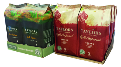
Solid colour (left) replaces a basic brown box to improve the brand’s shelf standout
Aside from the untidy appearance on shelf of a jagged edge where the perforations were resulting from a clumsily opened case, there was anecdotal evidence that Taylors’ products were in danger of being passed over in preference for others back of store due to the difficulty in being able to correctly identify them within a tight time frame. Part of the brief, therefore, was to ensure that the rebranding made its impact felt from the moment product was received at goods inward, thereby fulfilling another of the ‘big easies’.
In place of the previously used basic brown box with simple and sparing use of black ink, the new formats designed to hold six packs (2×3 or 1×6) were printed in a solid colour dependent upon actual range, ie the Master range in green, decaf in blue, half-caf in yellow, etc. A further innovation was the provision of a 40 mm front tab incorporating the Taylors’ name and logo for on-shelf display, added Mr Hunt.
‘Whilst consumers can still easily pick out ‘Rich Italian’, ‘Lazy Sunday’ or any of the eight other blends in the lifestyle range – including the seasonal ‘Allez! Allez!’, introduced specially to coincide with the staging of the first leg of this year’s Tour de France cycling event in Yorkshire – they now have the added reassurance of it being easily recognisable as a Taylors branded product.’
Close collaboration
In order to meet the requirements of Taylors’ automated case packing and palletising line, the SRP cases were produced using a 125 gsm white test liner R-flute stock by two separate corrugated suppliers: inspirepac in Wetherby and DS Smith at Featherstone in accordance with the brand owner’s dual sourcing strategy.
Despite their obvious competitiveness, the arrangement has worked well for both manufacturers, not least because of a commonality of the resources utilised, says inspirepac managing director, Mark Hawkins. ‘The biggest issue we have as an industry is the variation of papers from one supplier to another. Although there is a generic term, namely white topped Kraft to reference a standard substrate, the quality will vary dependent upon who has supplied it. In this instance, we agreed with DS Smith to use the same board and inks to ensure consistency across the job. To have two competitors working together denotes a positive customer-facing level of collaboration.’
Tony Foster, sales and marketing director of the UK packaging division of DS Smith, concurred. ‘Whilst working with Taylors on this exciting project, we were aware of the need to hit exacting pack standards along with tight print control. The shelf-ready pack must be easy to identify back of store, easy for the consumer to shop from and must visually support the products brand values. It is not unusual for us to be one of two corrugated suppliers producing packaging for the same product family, however that does mean that both providers must be in tight control of their processes. In this instance, careful structural specification went hand in hand with great production control. Colour was managed digitally to tight tolerances ensuring the range looked consistent with impressive on-shelf impact.’
Down on the delta
Whilst operating a dual source of supply required all parties to maintain a watchful eye to ensure consistency of various components entailed in the production process, such as runability, crease profiles, structural similarities and so forth, the quality of reproduction was of paramount importance. This was not just to exclude differentiation between the output from the two manufacturing sites, but to complement a gravure printed primary pack with a flexo printed SRP, often with only the gravure reference to go on.
Mark Hawkins is quick to attribute the high quality of the end result to inspirepac’s skilfully developed in-house colour management system comprising an eleven-colour Epson Stylus Pro 4900 desktop printer used for generating digital colour swatches for approval prior to production, a spectrophotometer used for measuring delta E readings and identifying adjustments that may need to be made during production, and a densitometer for measuring colour density of process colours. ‘The system has been in place for the past couple of years. We like to think of ourselves as printers that make boxes rather than box makers that print; the latter being more the norm in this sector – there is quite a difference. In fact, a lot of what we regard as competition is often the offset litho sector – we are trying to run with similar quality expectations and tolerances.
‘Just to illustrate the point, whilst we were working to a Delta E tolerance of 2.0 using L*a*b colour space and taking measurements every 15 minutes throughout the production run, we actually got it right down to 0.023, which is a very tight tolerance indeed.’
According to Mr Hawkins, the outcome is also a testament to the way in which the overall flexo process has raised its game over the past few years. ‘The issue with flexo in the past is that if you were to give a job to say three different offset printers you’d reasonably expect to get pretty much the same result from each of them; whereas with flexo there has been a wide variance of standards. Five years ago when there was a hell of a lot of skill needed to get to the top level, we pretty much had the quality market to ourselves. You still need those skills now, of course, but the tools of the trade are making it sustainable. Also, the big thing with post-print flexo now is that you can repeat the same quality job after job, that is something the process could not provide before – even between shifts – if there were variances in the substrate of the inks.
‘Certainly some of the new plate technology along with the inks is helping flexo to continuous improvement; the presses have also moved on as well. With all the advances that we have seen over the past few years it gives us the tools with which to create a box. Previously we have not had so many technical developments mature at the same time. I think that is because the market has driven it. The brands have demanded it and suppliers have been able to step up to the mark.’
Calling off around 3 million corrugated SRP units per year, Mr Hunt agrees that the skill set resident within the corrugated sector and the willingness to collaborate shown on the part of two direct competitors has paid off. ‘We have worked hard to ensure optimum consistency irrespective of source of supply, and our suppliers have likewise worked very hard with us, and with each other to support that objective. It is worth noting that even though our packing/filling line handles a test liner best of all the optional substrates, we did run a trial test to see if we could achieve a better solid with Kraft, and there was absolutely no difference.