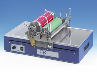
RK PrintCoat Instruments’ K303 Multicoater is a multi-tasking benchtop unit
Tom Kerchiss, managing director of RK PrintCoat Instruments, looks at how important colour is in packaging and considers the different emotional effects colour has on us as consumers.
Touching, tasting, hearing and seeing are important; they are all ways in which we gather information about the world around us. At its most basic, one could say that most of our sensory input in terms of what we see is determined by the light reflected off an object or substance at specific wavelengths and light values, which we physiologically interpret as colour. But colour is not just a physiological process; colour is subjective, – it also affects us emotionally and psychologically.
Different colours evoke different feelings and emotional responses, which from a brand owner’s perspective or a packaging technologist or indeed a designer of consumer products can make working with colour challenging to say the least. A designer, marketer and brand owner must bear in mind that colour can mean different things to different cultures and a colour that may be appropriate in one country can be totally inappropriate in another. Moreover colour can go in and out of fashion or in some instances the meaning associated with a particular colour can change, an example being black. Once associated with drabness and economic hard times, black is now favoured for some packages that contain luxury items ranging from chocolates to cosmetic packaging.
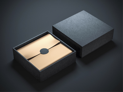
Black is regarded as the colour of power and authority and tends to stand out when used in packaging; black transmits a higher perceived value and is often used in packaging applications where the emphasis is on understated luxury. Many high-end consumer goods themselves are top sellers in black, namely expensive sports utility and executive limo type vehicles.
Written in black and white
White, the direct antithesis of black is also regarded as an ideal choice for the packaging of luxury goods and high status branded goods such as automobiles. In colour psychology white used to be regarded as a safe and unadventurous choice; however it is now viewed as a colour offering quiet sophistication, and providing the colour is communicated properly white is looked upon in packaging as conferring product status and trustworthiness.
Both black and white can have their meaning and value enhanced by the addition of other colours applied in moderation. For instance, a red spot added to white packaging adds excitement and draws interest to the product. With regard to the black, most people would agree that adding gold or a silver strip of colour to a black package increases the perception of luxury still, with black as the base colour, work. These two colours with black as the base colour works especially well with men’s personal care products.

Black and gold help convey a sense of luxury
Colour and packaging are inexorably linked. The range of products available in a superstore such as Wal-Mart, Tesco or Sainsbury’s is vast; brand owners often compete globally while many product sectors are highly fragmented, maturing, frequently oversaturated and commoditised. The need for a brand’s identity to stand out has therefore become critical; colour, graphics, and shape and to a lesser extent texture serve as product identifiers and differentiators.
Colour and design when working in unison advances the brand image and help to boost sales.
However, every time that a design is reproduced in printed form and especially if the design is to be reproduced on different packaging mediums, or even by different printers using different print processes, there is the potential for variation, the net effect of which is the undermining of consistent colour representation and a negative impact on brand appearance, sales and profit.
A product category where colour and graphical design has an enormous impact on sales is wine labels. The most important aspect of a wine producers product, such as bouquet, flavour and palatability cannot be evaluated until the consumer opens the bottle. This means that it is important for label to make a connection with both the product and the consumer. The label must have some depth and meaning, something relevant to the wine contained within the bottle; the label must also draw the customer in to effectively ”take a chance” on a try out.
From the brand owner and designer’s perspective the old adage of keep it simple tends not to apply. Wine has an allure about it, a pedigree that commands attention. For this reason elegantly designed labels perhaps incorporating gold embossing and intricate use of scrolls and antique motifs printed to exacting standards are the order of the day. That is not to say that simple clean-cut lines and use of one or two colours does not have a place.
Less is more
Newcomers, especially the small wineries introducing a product aimed at the cost conscious end of the market opt for the uncluttered look as a means of differentiating their product.
From a printer or converter’s perspective so many processing variables can influence colour outcome. For example, paper brightness, surface quality, and neutrality (deviance from colour cast) all have a dramatic effect on how colour inks will appear printed on their surface. A switch to a different paper brand may have a dramatic effect on colour reproduction.
Colour matching problems can be time consuming and vexing and occur for a variety of reasons.
Printing white on clear film for example is a particular problem, even with opaque inks. Most ink colour requires a proportion of light to pass through the ink film and be reflected back to the substrate in order to provide the correct match. If the substrate used absorbs a proportion of the spectrum from the illuminating light, the perceived colour will not match the customer agreed colour requirements.
Regardless of the issues that arise printers must meet the quality demands of customers who demand a high degree of expected colour, text and graphic accuracy. Colour communication devices, sometimes known as sample preparation systems or proofing devices, enable users of many descriptions to meet colour targets accurately and quickly and with minimal waste.
For companies with multiple methods of processing a colour matching, colour communication device, one that can be used for a variety of coatings is the K303 Multicoater, designed and developed by RK PrintCoat Instruments.
The K303 Multicoater is a multi-tasking benchtop unit available with quick and easily interchangeable gravure, flexo and meter bar coating heads. As a standard gravure proofer it is often used in laboratories for quality control on all ink/substrate combinations for colour comparison but also for determining factors such as printability and adhesion. The print area is 275 x 285mm and standard gravure plates are available.
Fitted with RK PrintCoat Instruments’ flexo printhead, the K303 Multicoater utilises doctored anilox flexo plates from which the ink is transferred via the stereo roller onto the substrate. Very fine pressure adjustments can be made to obtain a perfect print on most substrates by the use of micrometers – this facility enables the user to record settings for any given substrate. The flexo head can also be used to produce ”gravure-offset” proofs.
The addition of a meter bar coating head expands possibilities still further. The film applicator supplied can be used for all types of paper coatings, liquid printing inks, paints, varnishes, adhesives and other surface coatings. Bars are available for wet coatings from 4-500 microns. The accuracy and repeatability of the system makes it ideal for producing samples for quality control and research and development. The samples are suitable for computer colour matching, visual colour matching, adhesion and gloss.
Read the full September issue of FlexoTech here. Subscribe to the magazine for free – register your details here.


