

(L-R) Sante Conselvan, president of ATIF and FTA Europe, Xavier Boadas,
president of ATEF and Egidio Scotini, from the ATIF Technical Committee
Held in the Savoia Hotel Regency, Bologna, ATIF once again celebrated the best in Italian flexo printing with an awards dinner to acknowledge success, and a day of educational content to inspire success. Michal Lodej attended the event.
This year’s event was special for ATIF as FlexoDay 2017 marked the 10th anniversary of the conference which aims to educate and inspire flexo printers in Italy and from across Europe. Also supported by FTA Europe, the day was divided into two sessions; ATIF in the morning with presentations in Italian, and FTA Europe in the afternoon with presentations in English.
Sante Conselvan, president of ATIF and of FTA Europe, began proceedings, he said, ‘We keep growing year after year. Today 480 people are attending and every year it is a good opportunity to meet, exchange opinions, and grow together. It is a good time to do so, we are lucky to see that this market is growing and there will be a plus sign next to growth for next year.’
The biggest achievement from ATIF this year is the opening of its technical centre.
Mr Conselvan continued, ‘Six years ago when you saw me for the first time I spoke about the idea of a training centre, some people said I was a dreamer but here we are, working with the support of suppliers and all of you, we have done it. The aim is to train and to lobby institutions, we have a need in the packaging world to train professionals and to teach those who need to be retrained from litho, into flexo.’
It must be a proud moment for Mr Conselvan, who during his tenure as president has guided the association forward, but his time there in that particular role, is soon to be over. He said, ‘Over the last 10 years we have come a long way and technology has also improved. This is my sixth flexo day, but my train is about to arrive at the station. My mandate is over next year so this will be the last time I can address you here as president. Thank you so much for supporting me and contributing to the industry.’
Counting to 10
Egidio Scotini, from the ATIF Technical Committee, spoke to the audience about the association’s latest paper, Document 10, which looks at the characteristics of flexographic inks.
This document was drawn up by the association’s technical committee with a number of experts and technicians from ink manufacturers.
Mr Scotini said, ‘We think this is a very important document for presenting the point of view of ink formulators, with the end goal being to explain how to best use these printing inks.’
The inks are split into two categories; inks which dry from evaporation and inks which are cured by either UV light or electron beams.
The main components of ink are the pigment (colour) and the vehicle which transports this colour to the substrate, which is made up of three components; resins, additives and evaporation enhancers.
‘The colouring component is made from either organic or inorganic substances; all the pigments are internationally coded in the colour index which identifies the characteristics of that pigment. Included in Document 10 are a number of tables which list pigments and their characteristics. It is fundamental to choose the right pigment for the final product, ie if it contains soap the pigments must be resistant to soap. If the end product will be exposed to sunlight then the pigments need to be lightfast,’ explained Mr Scotini.
The role of resins is to wet the substance and to transfer the pigment and provide adhesion to the substrate. Once the ink reaches the substrate the solvents need to leave immediately, here the resins also help in the drying process.
He continued, ‘The evaporating components can be formed by organic solvents or water, and are used to dissolve the resins to make sure the ink is fluid and it also determines the drying speed. The solvents regulate viscosity; we all know how important that is.
‘Other micro components are the additives. I like to think of them as spices for a cook. Used in small quantities these give wonderful properties to the final dish. Additives are the same when making ink, providing important properties in printing by helping with drying or giving scratch resistance.’
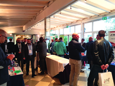
Attendees were given a chance to talk to industry suppliers between sessions
Back to school
Nina Davis, who has studied graphic arts at the University of Clemson on a Rossini Scholarship, gave a presentation on the university’s findings in extended colour gamut printing and the effect it has on the consumer.
In the experiment, each primary colour was tested in a drawdown. Data was applied to the characterisation tables and fingerprints to create press profiles to determine the largest colour gamut.
A monopigment expanded ink set was chosen with a white PET label. The drawdowns of CMYKOGV were each measured for density, LAB values, and opacity and all colours were measured to be within 2 Delta E.
The first model used an ink sequence based on opacity. This showed that to get the best result, a printer should use the most opaque ink first going down to the lowest; as an example putting orange before yellow produced a larger chroma triangle. In the experiment, the colour sequence which provided the largest tetrahedron was considered to be the largest colour gamut.
So what does this mean? The largest gamut produced 79% of Pantone colours as opposed to 78% of the smaller gamut. This showed that a 6% increase in the size of gamut only equated to an additional 1% of Pantone colours being available, which works out as approximately 70 more colours.
Dealing with corrugated
Gerardo Budetti, from Italian printer Antonio Sada & Figli, spoke about his company’s corrugated board experience. He said, ‘Pre-print corrugated board gives you assurance of quality, however you need very long runs for this to be economical, so post print is the way we went. We bought a high definition machine for corrugated printing. Shortly after we bought the machine we realised one was not enough.
‘Board is what we call a live material, temperature and humidity can have huge effects on it. It’s not stable in shape; it can warp and take an incorrect shape which affects the register, even using advanced machines with good register qualities cannot help.’
The colour variation in the material is also a huge problem. Three white uncoated papers printed in laboratory conditions with the same ink and colour, can still produce very different results.
A third problem for printing on corrugated board is the wash boarding effect. The wave in the board means that when trying to reach the lowest part of the board, the dots hitting the highest part become squashed.
Mr Budetti continued, ‘To solve our problems we changed our mind set and researched all the elements of printing; paper, board structure, anilox rollers, and plates. Training was also very important, we were all committed to research and development and training our staff. The process started way back 15 years ago and this has lead us successfully on the market, and we are really proud of our success last year where we participated in and obtained two industry awards. The good results show that we are going in the right direction.’
Over to Europe
As the second session began, the presentations were given in English. Peter Verryt , segment manager, label and packaging, Fujifilm Graphic Systems Europe, spoke about how to make flexo more profitable. First of all he turned his attention to a recent survey conducted among US label converters.
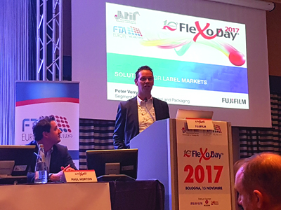
Peter Verryt, segment manager, label and packaging, Fujifilm Graphic Systems Europe, takes to the lectern
The question to the label market was, ‘Why would your customer change their label vendor?’ The top four answers were; quality, delivery, responsiveness and capability.
Mr Verryt said, ‘In the top four cost didn’t even come into it. So is cost not important? No it still is important, but if the top four aren’t being achieved, being a low cost option won’t help you.’
He then turned his presentation to the attention of retrofittable inkjet units. ‘When you look at Labelexpo Europe four or six years ago, we saw a lot of digital solutions designed to complement flexo, and this development has boomed. There were 34 digital vendors at the show this year, and this will probably grow, which is a good thing.
‘Now what we believe is that conventional presses still have a long life ahead of them regardless of the boom in digital. But you need to keep your presses future proofed, and fine tune them just like a car.
‘That’s why Fujifilm launched the Samba inkjet printing head. Not everyone has enough workload to fill an standalone digital printing press, but retrofitting the digital capability onto a conventional press can make a it much more flexible.’
Conjuring colour
Paul Horton, graphic services manager at Parkside Flexibles in the UK, spoke about his experiences in flexo and how the company has developed data recording practices to have control over all the jobs they do.
‘At my first job as a printer, I was called to answer a question from a customer who wasn’t happy. The image we created was ok, but it was not what the customer asked for. The image was for a packet of croissants, with an image of a croissant and some jam together. Of course this was at a time when the operators were not recording anything so it was produced using the dark arts of flexo.
‘We spent all day to get the job done correctly, and we got as close as we could. We said that actually we think the jam looks really good, they simply replied, “We sell croissants, not jam”. Ultimately we didn’t listen enough to what the customer wanted.’
Mr Horton used audience participation for an impactful second half of his presentation. Displaying a picture of an x-ray of a brain he asked everyone to look at the picture, then asked how many people saw the picture of the gorilla, hidden in plain sight in the image. Not many people raised their hands.
He said, ‘As humans we are very poor at seeing colour. Inattentional blindness, what we think we are looking at can actually define what we are seeing. So when we look at colour we need to look at things with an open mind. We get lots of people who use terms and phrases that mean very little, what’s sparkly to one person is different to another. So now we need to use data and science to measure what we print.’
Eighty-five percent of consumers cite colour as the reason they pick a product. Ultimately it is the printers who have to manage that colour over a number of different substrates; the colour needs to be consistent.
‘How do we do all this?’ asked Mr Horton, ‘Pantone books love them or hate them they have been around for a long time, but when we talk about Delta E we are moving away from physical standards and instead using digital standards. These do not fade or change, and are the same the world over. We can embed this colour data into the job, and then we can measure the colour on press.’
Another experiment from Mr Horton demonstrated the importance of accurate colour measurement, rather than relying on your own two eyes. He showed two images, the first, a black and white countryside scene. The second was in colour, and could be described as a negative of the same image but without any discernible features. After staring at the second image, we were shown the first again, and immediately we saw green fields, where actually, it was still in black and white.
Mr Horton explained, ‘The cones in our eyes are lazy and they don’t change shape quickly. This is what made us see the colours on the image which weren’t there and just shows how hard colour can be to identify. In our printing process, there are lots of variables that need to be controlled, but if you can measure it you can control it.’